What is Ecocar?
The EcoCAR Mobility Challenge (EcoCAR) is the latest U.S. Department of Energy (DOE) Advanced Vehicle Technology Competition (AVTC) series. The four-year competition will challenge 12 university teams to apply advanced propulsion systems, as well as connected and automated vehicle technology to improve the energy efficiency, safety and consumer appeal of the 2019 Chevrolet Blazer – Specifically for the carsharing market (avtcseries.org).
My Role
I joined the UW EcoCAR team in the second year of the competition as a UX researcher in September of 2019. I worked on the research team before becoming the Research Lead in December of 2020. In April of 2021, wrapping up the third year of the EcoCAR competition I took over as Project Manager for the HMI team. Given the close-knit and growth focused nature of our team, I spent much time working with the design team in HMI, as well as the Computer Assisted Vision (CAV) and Systems Safety Teams.
Our Process
Below is our project glide path detailing our processes throughout the entire duration of the four year competition.
Year Two
Background Research
Literature reviews
As much of the team was previously unfamiliar with the fundamentals of car interior design, we began by performing literature reviews on existing in-car technologies, ranging from dashboard buttons, heads up displays, to gesture controls.
Each member of the team focused on a specific topic, meeting up to share and discuss our findings. Our key findings included:
•Fitt's Law
○ Time to reach target versus distance to reach target
○ Determines interface distance from steering wheel
•Gesture Controls
○ Pointing is more intuitive than gestures, but it is more difficult to track
○ Users enjoy gestures more than traditional buttons for secondary tasks
•Autonomy
○ Explaining what the driver controls and what the vehicle controls
○ Providing a comfortable experience where you trust the vehicle
•Infotainment Systems
○ Display important information at eye-level
○ Secondary information can go lower
Competitive Analysis
We then looked at how different car manufacturers approached the dashboard design process, and what users felt worked about each varied approach.
Although all infotainment systems had largely identical functionality they varied in implementation, highlighting findings from several manufacturers:
• BMW "iDrive"
○ Directional, push, spin on dial, complete lack of touchscreens
○ Many radio buttons, many small and clumped together
•Tesla Infotainment
○ Large screen allows multitasking
○ Scroll wheel with multi-function (cruise control, mirrors, volume)
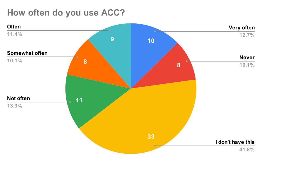
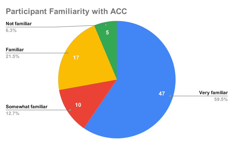
For the feature ACC, we found that although participants tended to know what it was, many of them didn't have said feature, and those that did have the feature were split in frequency of usage.
Our key takeaways from this survey included the fact that most users indicated they would want an on-boarding feature in a rental car, users were not too comfortable with CAV features:
"Lane keep assist is always difficult at first. Trusting that the car will do what it’s advertised to do is always a leap at first."
Preliminary Findings
Design Goals
Accumulating all of the information and responses from our surveys, competitive analysis, and literature reviews the team ideated upon and created the following goals to help guide our design.
These goals then helped to define our problem statement that would further refine the direction taken by our prototype:
How can we educate drivers about Adaptive Cruise Control (ACC) in a Mobility as a Service (MaaS) environment?
Initial Prototyping
Story-boarding
In order to visualize potential designs and apply what we learned in our research in terms of what users may be familiar with and how they would want to learn about CAV features we made several storyboards. These were a good opportunity to think about what we could do improve a users on-boarding experience perhaps with ideas that were a little outside the box.
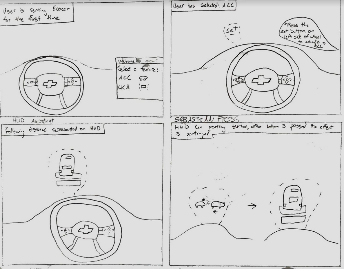
HUD display shows CAV feature functionality
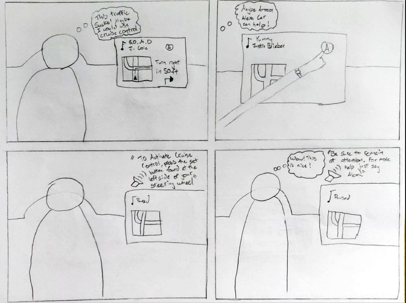
Voice Assistant provides auditory instructions on how to use CAV features
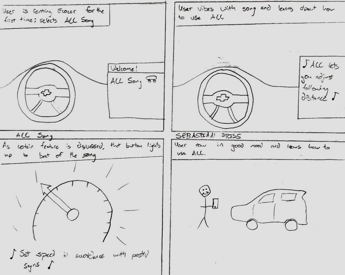
Song teaches how CAV features work
Story-boarding allowed us to ignore feasibility temporarily and see what we might want if we were undergoing the on-boarding process. Although not necessarily the ideas that were further developed this exploratory design allowed granted refined our direction and brought us closer to a final design.
Preliminary Mock-ups
The EcoCar Connected and Automated Vehicle (CAV) team is tasked with developing semi-autonomous features, such as adaptive cruise control and lane-keep assist. As the Human-Machine Interface team it's our job to ensure the user has everything they need to learn and safely use these features on the road.
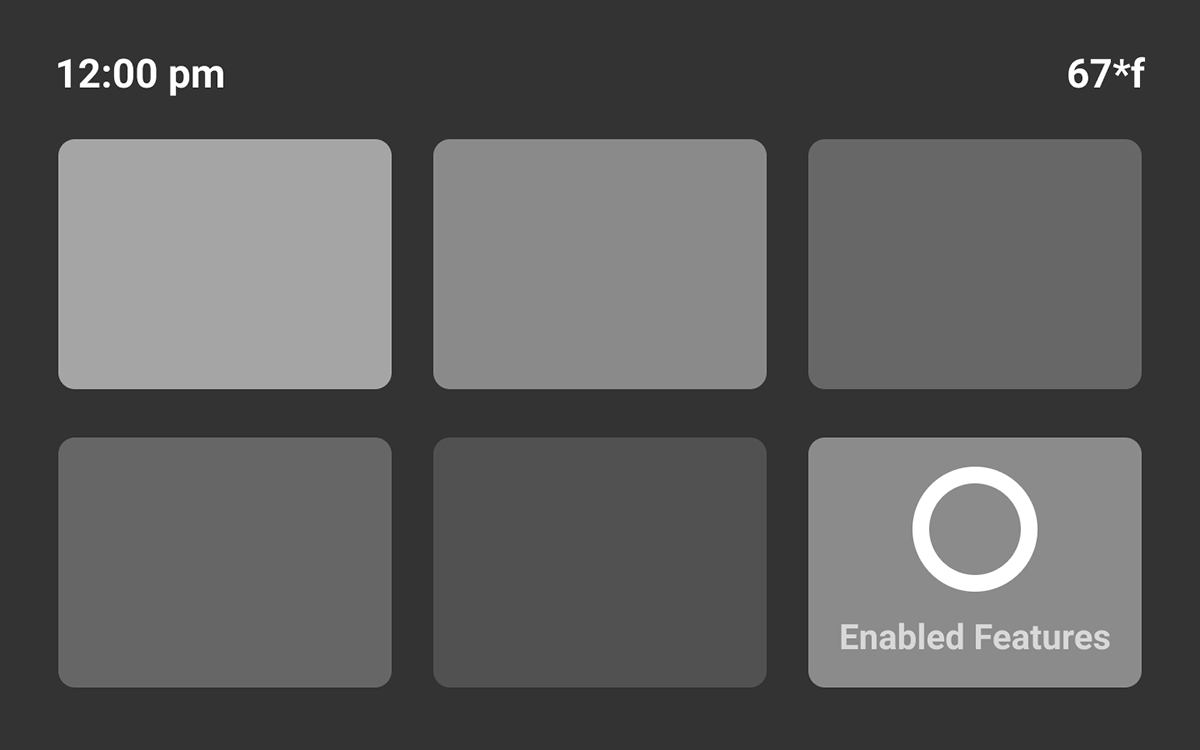
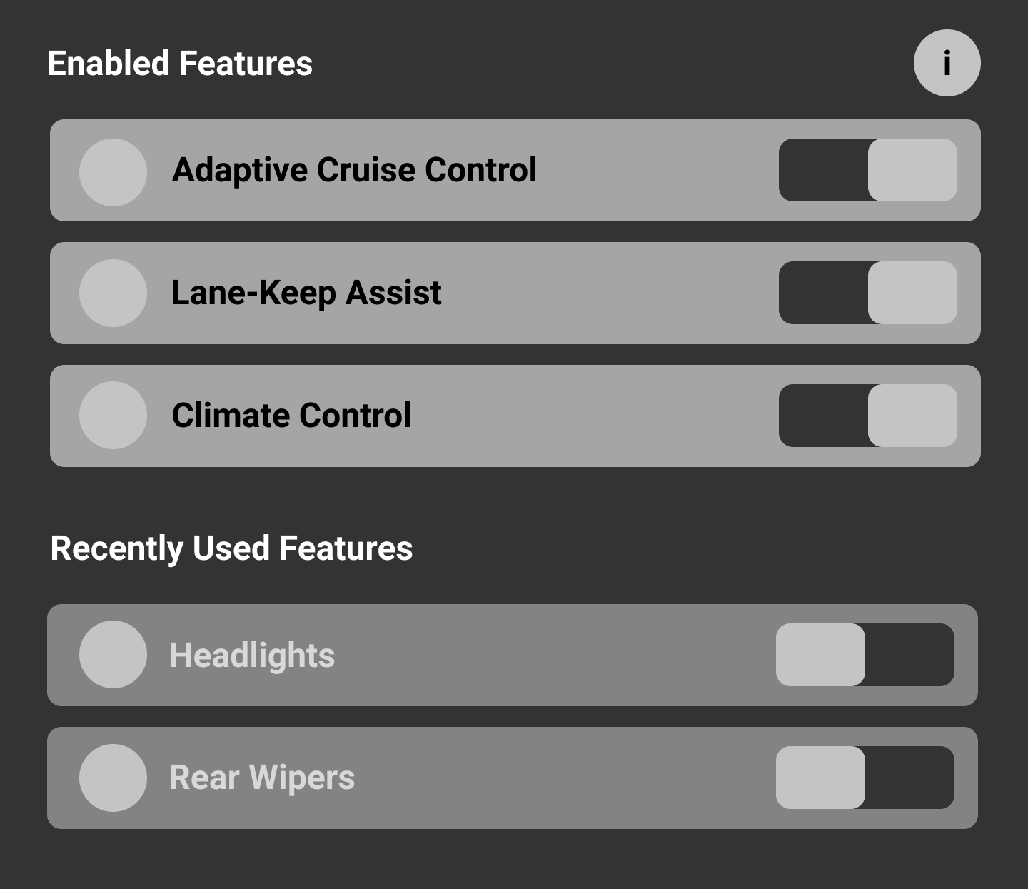
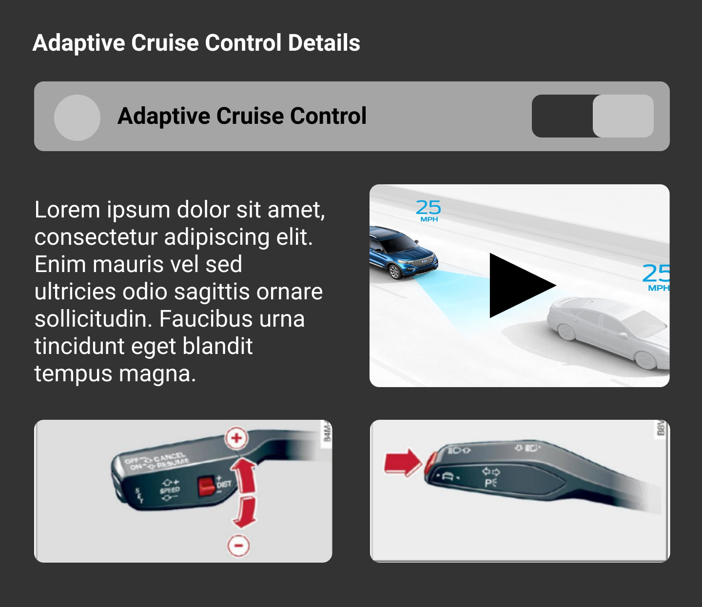
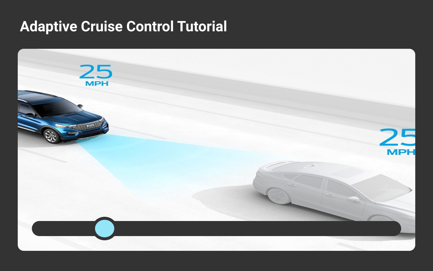
These mock-ups show initial prototypes of what the infotainment system might look like. While far from comprehensive they give an idea of what steps the user will take and what options will be presented to users in gaining information on the CAV features.
Year THree
Background Research
Interviews
Going into the third year of the competition the team conducted interviews with ride sharing users. Unlike a traditional infotainment system, the on-boarding experience in a ride-sharing vehicle has a much greater impact on user experience. Following these interviews the team outlined the following pain-points that were associated with ride-sharing vehicles:
•General Confusion
○ New car features are not intuitively labeled
•Lack of familiarity
○ Use of car’s features is limited without familiarity
○ If the driver tries to use a feature they don’t know how to use it could create a dangerous
situation
Through user testimony, as well as feedback from the prior years competition, the team revised the problem statement that guided our work:
How might users who are unfamiliar with ACC achieve sufficient education in a Mobility as a Service (MaaS) environment so that they can safely and successfully operate an unfamiliar vehicle?
Prototype GOals
Guided by our revised problem statement and prior research and design goals, the team iterated upon a new set of goals to ensure our prototype satisfied user needs as an educational on boarding system in a ride-sharing vehicle.
User needs Evaluation
Catering to a variety of learning styles and to explore potential solutions that addressed both visual and physical learning styles the team created a feasibility matrix to help guide the direction of our prototype and potential make it more engaging.
After conducting additional surveys focused on participants who had specifically used ride-sharing services in the past we then performed rounds of ideation based off of the survey data on what our potential solution might look like.
Wireframes
Usability testing
During this time in Year Three I was leading the research team, so while the design team worked on these wire frames, my team created a test kit to usability test the above prototype. The main goal of the testing phase it to check that our application is usable. We wanted to measure this by testing the discoverability of features, checking the affordances of certain elements and measuring how effective the prototype was at teaching ACC to users.
Participant Criteria
Findings
Based on our usability tests, we recommended addressing the following results to the design team.• Lack of context in regards to pop-ups within the app.
• Confusion over differences between wheel/button/switch in the onboarding.
• Lack of intuitive order in onboarding processes.
• Confusion over the term ‘learn’. Lack of user location icon on the map.
• Confusion over difference between cruise control and adaptive cruise control.
• Confusion about why some links within the app are darkened.
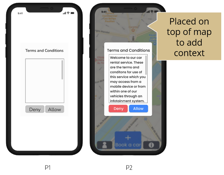
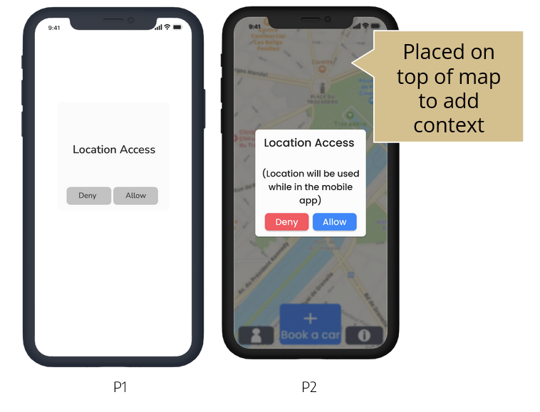
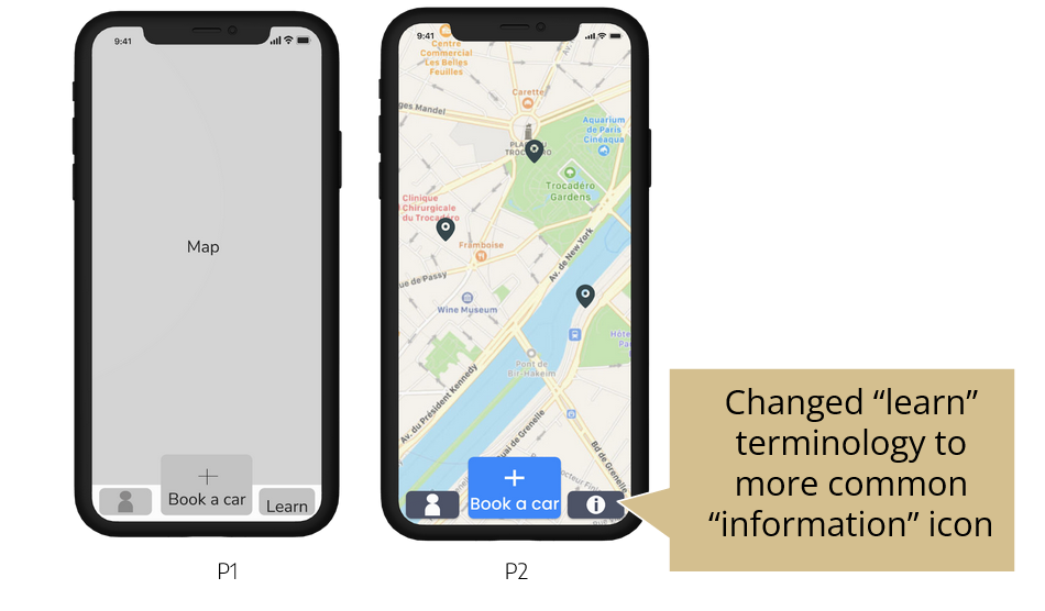
Medium Fidelity Prototype
Based on our usability tests, we recommended addressing the following results to the design team.
• Lack of user attention throughout the onboarding process
• Lack of intuitive order in onboarding processes
• Confusion over the term ‘onboarding’
• Lack of fully prototyped options, particularly in regards to sign up options
Reflection
In May of 2021 I presented our prototype at the Year Three competition and achieved a fourth place finish! The competition was a great learning experience and an excellent opportunity to interface with professionals in the Automotive UX world. Below are my biggest takeaways that I shared with my team following the competition and moving into Year Four.
Year Four
Coming SOOn