Overview
Uber is a platform where drivers connect with riders, eaters, restaurants, and grocery stores. As Uber has developed a core user group they have begun releasing additional features. Uber Reserve was released in November 2020 allowing users to book upcoming trips up to 30 days in advance.
The following project was sponsored by Uber and completed over the course of 10 weeks as part of a Usability Research class at the University of Washington. This project was a collaborative effort of myself and my peers; Britnie Chin, Dena Sabha, and Kerry Horton. Tasked with analyzing user perceptions on both web and mobile versions of Uber Reserve, our team formulated the following research question based off of our preliminary survey insights:
How might we better support Uber users - both on the mobile application and desktop interface - on navigating them to and through the Uber Reserve feature when a scheduled ride is needed (i.e. a ride to the airport)?
Our Process
1. Task Analysis
2. Exploratory Study
3. Usability Test Kit
4. Usability Testing
5. Final Report
In order to effectively design a usability test that would provide meaningful insights into users experiences with the Uber Reserve platform we first had to understand what the users goals were when using the system.
Task Analysis
Our task analysis consisted of our team familiarizing ourselves with the Uber Reserve system as well as the rest of the Uber app. Exploring potential paths that a user can take when navigating the interface, how many steps it would take to reach the desired endpoint, as well as notable experiences/sentiments while doing so. The team documented each step, taken in reaching the following endpoints: Logging in as a rider, viewing ride history, and booking a ride for the next morning. Throughout the process positive and negative reactions were highlighted.
The task analysis was valuable in that it allowed us as researchers to experience the application from the perspective from the users. Pain points that we encountered were unlikely to be one-off, meaning that our experience with the interface molded what we would be evaluating the users on in coming usability testing, and assisted the team in developing substantive questions in our exploratory study.
Exploratory Study
Following our task analysis we developed an exploratory study to further understand motivations and experiences people have when using the Uber app, as well as examine which elements of the app are used more frequently and for what purpose. This study (n = 66) was conducted via convenience sampling on a Google Form.
We found that although our users all had varying usage patterns, one thing stood out too us; only one participant had knowingly used Uber Reserve (1.6%). This lack of awareness with respect to Uber Reserve caught us offguard, however moving forward the team generated the following recommendations to guide our usability testing:
Explore why people have not used Uber Reserve.
- Uber Reserve is a relatively new feature that came out during the pandemic, and our survey shows that people use Uber for planned events such as going to the airport or to social events. We want to understand why users gravitate for a ride rather than reserve.
Explore ways to inform and educate users on less commonly used features, i.e. Reserve.
- Lack of visual hierarchy between available feature sets results in users gravitating to features they are more comfortable with.
Explore ways to improve user’s confidence within the experience.
- Inconsistent safety and health measures deter users from returning to Uber features.
One limitation of the survey was that the questions made the assumption that participants were evaluating their experience with the mobile interface. While it is likely that nearly all the participants lacked exposure to the website due to it's limited popularity and recent release, the diction of the questions should have indicated this assumption.
Test Kit
To ensure that the team was adequately prepared for our upcoming usability tests and to organize all of our materials in a useful and meaningful way the team developed a usability test kit. We created a screening questionnaire to identify potential participants, and filtered our final 10 participants based on quality of responses to initial screener questions, also known as Judgement Sampling.
The team developed a comprehensive script, email templates for communicating with participants, note-taking forms, as well as consent forms regarding the usability testing. To ensure everything worked properly and to our satisfaction the team conducted two pilot tests with members of our class, and implemented the necessary revisions thereafter. The importance of creating a comprehensive test kit prior to usability testing cannot be undermined; not only in mitigating any potential bias due to the consistency across tests, but in providing high quality participants and ensuring the potential for high quality responses.
Usability Test
All of our tests were conducted asynchronously via Zoom, with 10 participants from across the US. A large range of ages from 20-50, with 6 of our participants working in the tech industry. We split the participants into two groups, with one beginning by going through the mobile interface, and the other beginning with the web interface. Ideally the participants not be exposed to both interfaces, as experience with one will influence their experience with the other. However, due to time constraints, each participants worked on both web and mobile. Participants were asked to complete two tasks on each of the platforms:
Reserve a ride one week in advance
Cancel the ride for both mobile and web platforms.
Usability Test Analysis
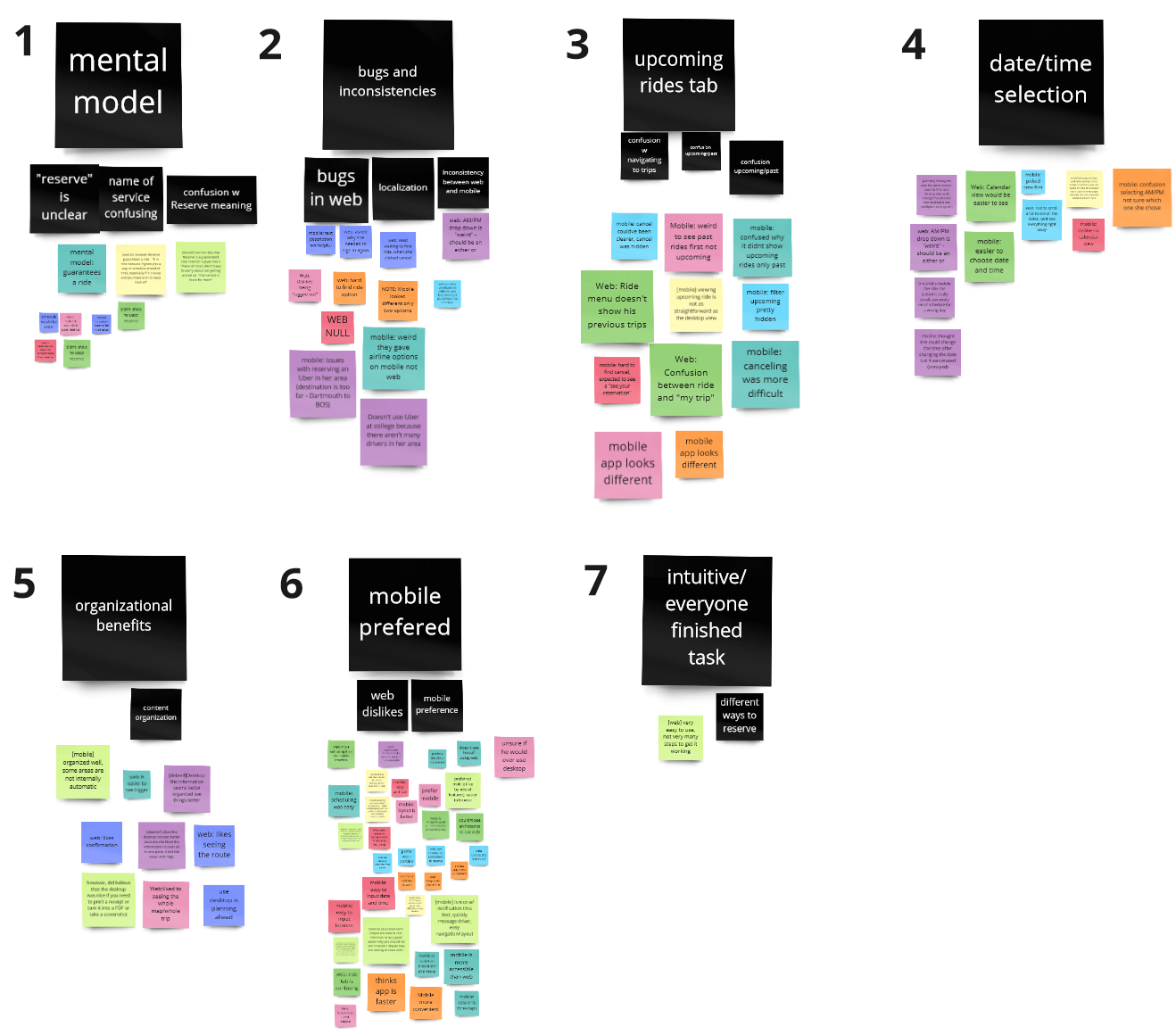
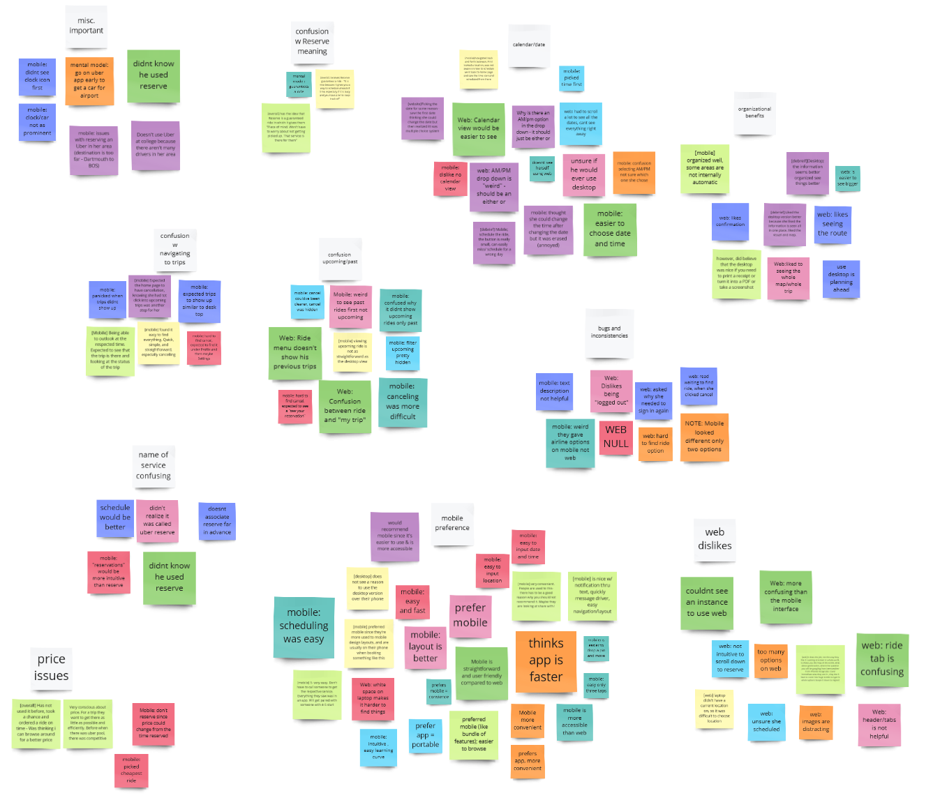
In conducting the usability tests, the team created the roles of a moderator as well as a note taker. This distribution of responsibilities allowed for an enhanced focus on each role, ensuring that the moderator was not unfocused due to note taking responsibilities and vice-versa. Following the completion of the usability testing the team began affinity diagramming to unify ideas and concepts that participants discussed during the study. Given the large quantity of data, grouping based on pain-points or positive experiences allowed the team to have a better overview of what changes to the usability of the Uber interface might be valuable.
Using a Miro board to create the affinity diagrams allowed the team to easily distinguish between the users through color, as well as offering the benefit of enhanced collaborative features and the ability to revise and revisit ideas. Given the groupings of the pain-points the team was able to identify 7 key issues, shown below in black which highlighted shortcomings in the usability of the Uber reserve interface.


Usability Test Findings
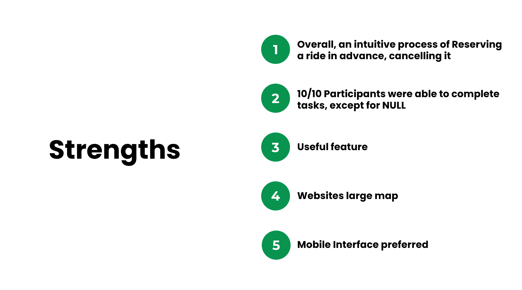
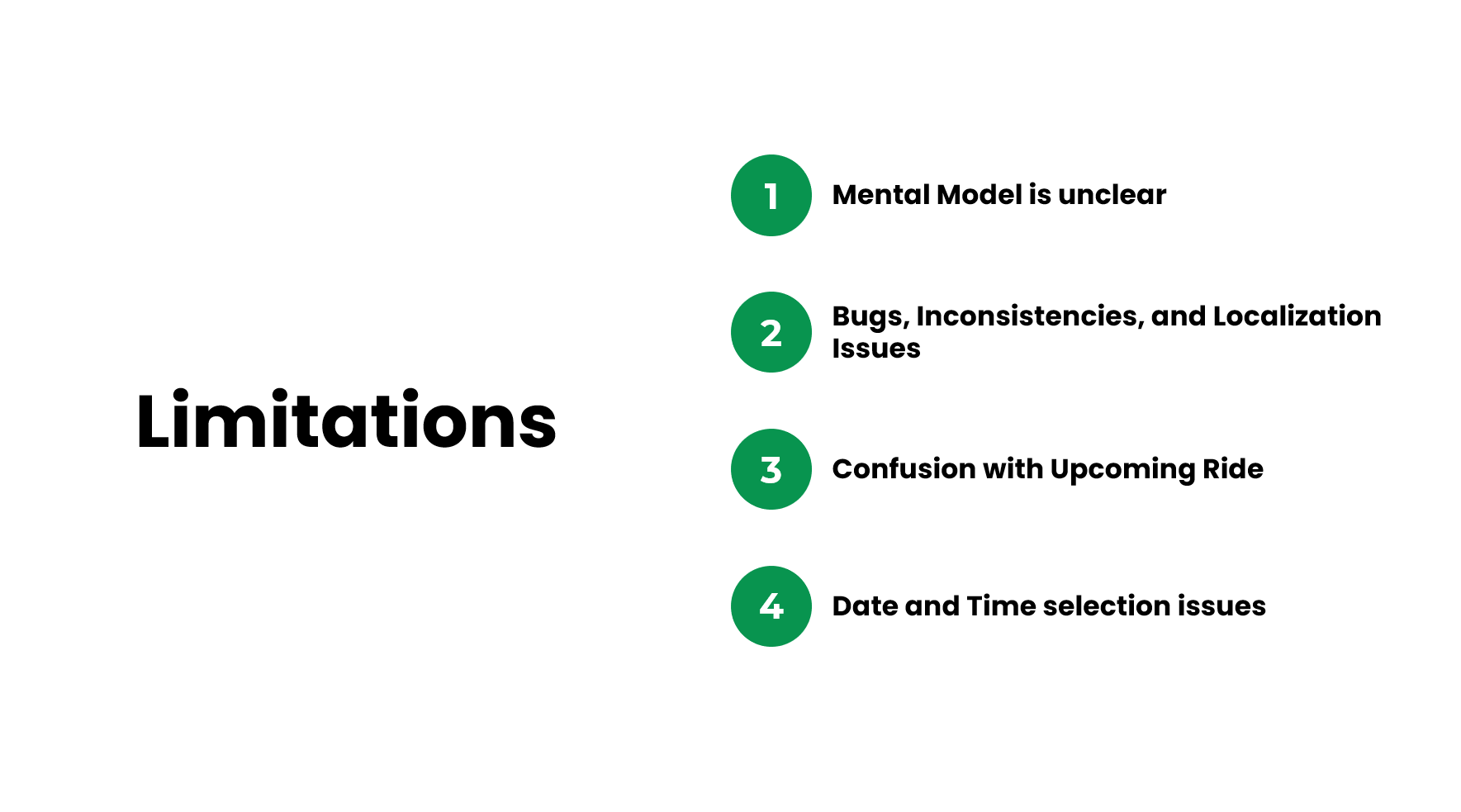
Following the analysis of our results our team began outlining the strengths and limitations of both the web and mobile Uber Reserve interface. The strengths and limitations functioned as a summary of the following seven findings:
1. Uber Reserve Mental Model is Unclear (8/10)
2. Bugs, Inconsistencies, and Localization Issues within Web and Mobile (8/10)
3. Confusion with upcoming rides (6/10)
4. Issue with date and time selection (6/10)
5. Each Platform (Web and Mobile) has its strengths and weaknesses (10/10)
6. Participants prefer the mobile interface. (8/9)
7. Reserving a ride is an intuitive experience- all participants completed the tasks (10/10)
The numbers ex. (8/10) indicate that 8 out of 10 users were categorized to agree with the corresponding finding. For finding 6 their are only 9 participants indicated since one user was unable to use the Uber Reserve website due to technical difficulties.


Finding 1
The most significant finding of our usability study was the most of the participants had a fundamental misunderstanding of what Uber Reserve meant. After going through the two tasks prescribed by the team many still failed to acknowledge that the service they had just used was called Uber Reserve. Additionally their was confusion around what Uber Reserve even meant, and the other findings namely, the inconsistencies in the layout, meant that Uber Reserve was difficult to find, and even when it was used, was unclear to users.
“Schedule might be a better word; it implies you can do it very far in the future. But Reserve I don’t associate the time to be that far in the future” - P7
“Uber Reserve? I honestly don’t know what that is, I’m going to assume that it was what we just did.” -P10
Finding 2
Inconsistencies as well as various bugs inhibited user experience across Ubers web and mobile and web applications. User expectations in terms of interface architecture were not met, either due to technical issues or due to the fact that the two platforms functioned differently. Interestingly, we found many of these layout changes had to do with localization, as users from different areas saw different layouts in terms of how the information on the interface was presented.
“I don’t like that it seems to log me out, when you click on the homepage it says log in again, which makes it seem like it logged me out. But when you click it [Sign in to ride] I’m still logged in. It’s kind of weird.” -P10
“It’s interesting how it gave me airline options, since I didn’t see that on the desktop” -P6
Usability Scores
To accurately quantify our results the team used several metrics to evaluate the usability of the Uber Reserve interface on both web and mobile platforms.
The first metric used was the Net Promoter Score (NPS). This score assesses the desirability and customer loyalty of the product. The index ranges from -100 and 100, a good score being above 0. The NPS scoring is beneficial in that it provides fast results and is incredibly simple, as the participant only has to respond and justify their response to the following question:
On a scale from 1 to 10 (1 = not at all likely, 10 = very likely), how likely are you to recommend this product to a friend?
Given that users were evaluating two systems in our Usability Test, a large focus in our post-test questionnaires was concision. Having previous experience using the System Usability Scale(SUS), the team was keen to re-employ that questionnaires. However SUS has 10 questions, which would add substantial time onto the Usability Test. The team discovered that the UMUX-Lite evaluation could be converted to a SUS score, allowing for effective comparison between the perception and ease of use for Uber Reserve and that of countless other sites online. The UMUX scores were derived from the two following questions on a scale of 1-5 (1 being bad and 5 being excellent):
Can you please explain your rating?
This system’s capabilities meet my requirements.
This system is easy to use.
These two usability scores allowed us to benchmark Uber Reserves performance, and allowed us to share quantitative metrics with shareholders at Uber. Due to the competitive nature of the ride-sharing industry the scores themselves will not be shared in this page. Please reach out for more information.Recommendations
Our recommendations are listed below in descending order of complexity and priority:
Short-term
User awareness (ads, onboarding to new feature):
Similar to how Uber ran ads for their vaccine feature, finding a way to spread awareness about what Reserve is and how it works might help change the way people understand and use Uber to schedule rides in advance.
Further research on whether or not their is potential market for this feature is an important next step. What use cases would a user want to reserve a ride in advance, how will the price affect how one schedules a ride ect.
Findings addressed: #1, #7
Increase feature visibility:
Many participants found it difficult to find pertinent features (i.e. Reserve, Trips, Date/Time icon). By giving these particular features greater hierarchical meaning on the page, it could increase their visibility to the user. To achieve this, Uber could utilize accent colors, bolding, and/or scaling. Establishing hierarchy increases participants' satisfaction and confidence in completing tasks.
Therefore, further iteration would be necessary to redesign the feature layout. Conducting additional usability tests could reveal if the changes to feature visibility improved users’ experience.
Findings addressed: #3, #4
Improve date and time selection:
Make the date and time selection easier to see, and more accessible when screens or items on the screen make the section smaller. Differentiate the color of what is being selected to be more clear e.g AM/PM. Eliminate the web option to only show AM or PM, instead of AM/PM, AM, and PM.
Possible exploration using a calendar view to pick the date, since users can Reserve up to 30 days in advance. Finding the date through scroll could take more time, and increase difficulty when trying to reserve a ride quicker.
Findings addressed: #4, #2
Continue adding organizational benefits:
Participants liked when the interface was well organized, simple, and intuitive. Continue adding checkpoints, like showing the full route and confirmations, to increase the confidence of users.
Consider adding more positive checkpoints to clarify users are correctly finishing tasks, often times on web positive checkpoints are less clear or small. Add confirmation rides on screen, clear messages (e.g cancellation fees, reserve information, and cancel messages), and full routes of reservation/ride.
Findings addressed: #5
Declutter web interface:
Participants felt like there were too many navigational tabs on the web interface, 3 participants got lost in the “Ride” and “Airport” tabs when trying to find personal ride history. All potential action items are grouped under the profile menu, in order to optimize user experience the location of personal information needs to be made clearer.
Potential for future A/B testing, exploring either adopting the hamburger menu layout of the mobile interface, or using entirely navigational tabs and moving the location of personal information alongside additional features.
Findings addressed: #2, #5, #6
Long-term
Minimize differences within regional user groups
Considering the regional differences in Uber’s availability and functionality, the importance of localization remains a priority in supporting a streamlined user experience. However, among like user groups (i.e. Uber users in Seattle), the interface should remain consistent.
Finding addressed: #2
Usability Study Takeaways
Although this usability study was incredibly successful, the following are my key takeaways and what I would do differently in conducting a future usability study:
1. Recruit from a broader age range and variety of technical levels
2. The importance of pilot testing all test components, having each team member complete all roles in doing so (ex. moderator)
3. Isolate participants from participating on both platforms
4. Use internal metrics to communicate findings with stakeholders
2. The importance of pilot testing all test components, having each team member complete all roles in doing so (ex. moderator)
3. Isolate participants from participating on both platforms
4. Use internal metrics to communicate findings with stakeholders